Brand & Identity Kit
Official assets for integrating UniAuth sign-in into your application. Shield marks, pre-built buttons, badges, and embeddable widgets — all in one place.
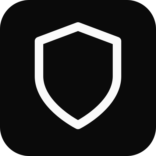
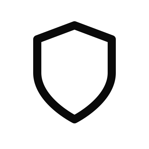
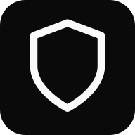
Shield Mark
The UniAuth shield is the primary brand mark. Use it as the recognizable icon in sign-in buttons, app listings, and documentation.
<img src="https://uniauth.id/brand/oauth/mark.svg" alt="UniAuth" width="24" height="24" />Sign-In Buttons
Interactive playground — pick theme, size, shape, and text to preview the button live with real hover states. Copy the generated HTML to embed in your app.
Live demo — hover & click
SVG assets


Trust Badges
Interactive playground — pick theme and text variant to preview the badge live with hover effect. Copy the HTML to embed in your footer, sidebar, or checkout page.
Flat Pill Badges
Shields.io-style flat badges for README files, documentation, and dashboards. Pick a variant and copy the Markdown or HTML.

Trust Seals
Prominent trust seals for checkout pages, sidebars, and security pages. Toggle theme and style to preview, then copy the HTML.

Floating Badge & Trust Bar
Live demos — toggle to show the floating corner badge or footer trust bar. Hover the floating badge to see the lift effect.
Widget — Drop-in JavaScript
The fastest way to add UniAuth sign-in. One script tag renders a branded button and handles the full PKCE OAuth flow automatically.
Popup mode (recommended for desktop)
User stays on your page. Auth happens in a popup. Tokens delivered via callback.
<script src="https://uniauth.id/brand/oauth/uniauth-widget.js"></script>

<div id="uniauth-signin"></div>

<script>
  UniAuth.renderButton('#uniauth-signin', {
    clientId: 'your-client-id',
    redirectUri: 'https://yourapp.com/callback',
    mode: 'popup',  // opens auth in a centered popup
    theme: 'dark',
    onSuccess: function(result) {
      console.log('Logged in!', result.accessToken);
    },
    onError: function(err) {
      console.error('Auth failed:', err.error);
    }
  });
</script>
Redirect mode
Navigates the full page to UniAuth, redirects back with the code. Works everywhere.
<script src="https://uniauth.id/brand/oauth/uniauth-widget.js"></script>

<div id="uniauth-signin"></div>

<script>
  UniAuth.renderButton('#uniauth-signin', {
    clientId: 'your-client-id',
    redirectUri: 'https://yourapp.com/callback',
    mode: 'redirect',  // full-page navigation
    theme: 'dark'
  });
</script>

<!-- On your /callback page: -->
<script>
  UniAuth.handleCallback({
    clientId: 'your-client-id',
    redirectUri: 'https://yourapp.com/callback'
  }).then(function(result) {
    if (result.success) {
      console.log('Access token:', result.accessToken);
    }
  });
</script>
Auto-detect (default)
mode omitted — auto-detects: popup on desktop, redirect on mobile.
UniAuth.renderButton('#uniauth-signin', {
  clientId: 'your-client-id',
  redirectUri: 'https://yourapp.com/callback',
  // mode omitted — auto-detects popup (desktop) or redirect (mobile)
});
All options
| Option | Type | Default | Description |
|---|---|---|---|
| clientId | string | — | Your OAuth client ID (required) |
| redirectUri | string | origin/callback | Where to redirect after auth |
| mode | string | auto | "popup" | "redirect" — auto-detects if omitted |
| scope | string | "openid profile email" | OAuth scopes to request |
| theme | string | "dark" | "dark" | "light" | "outline" | "neutral" |
| size | string | "standard" | "small" | "standard" | "large" |
| text | string | "signin" | "signin" | "continue" |
| shape | string | "rectangular" | "rectangular" | "pill" |
| width | number | auto | Fixed width in pixels |
| locale | string | "en" | Button text locale |
| onSuccess | function | — | Callback with tokens after popup auth completes |
| onError | function | — | Callback on auth error or popup closed |
| onSignIn | function | — | Custom click handler (skips OAuth flow) |
| popupWidth | number | 480 | Popup window width in pixels |
| popupHeight | number | 640 | Popup window height in pixels |
| loginHint | string | — | Pre-fill email on UniAuth login |
| prompt | string | — | "login" | "consent" | "none" |
| nonce | string | — | ID token nonce for replay protection |
Render a badge
<div id="uniauth-badge"></div>
<script>
  UniAuth.renderBadge('#uniauth-badge', {
    theme: 'light',  // 'light' | 'dark'
    text: 'secured'  // 'powered' | 'secured' | 'identity'
  });
</script>
CSS Classes — HTML Integration
For full control, use the standalone CSS file with semantic class names. No JavaScript required — just HTML and CSS.
Include the stylesheet
<link rel="stylesheet"
      href="https://uniauth.id/brand/oauth/uniauth-buttons.css" />
Dark button
<a href="https://uniauth.id/api/oauth/authorize?client_id=YOUR_ID&..."
   class="uniauth-btn uniauth-btn-dark">
  <span class="uniauth-btn-icon"></span>
  Sign in with UniAuth
</a>
Light button
<a href="..." class="uniauth-btn uniauth-btn-light">
  <span class="uniauth-btn-icon"></span>
  Sign in with UniAuth
</a>
Outline button
<a href="..." class="uniauth-btn uniauth-btn-outline">
  <span class="uniauth-btn-icon"></span>
  Continue with UniAuth
</a>
Modifiers
<!-- Small -->
<a class="uniauth-btn uniauth-btn-dark uniauth-btn-sm">...</a>

<!-- Large -->
<a class="uniauth-btn uniauth-btn-light uniauth-btn-lg">...</a>

<!-- Pill shape -->
<a class="uniauth-btn uniauth-btn-dark uniauth-btn-pill">...</a>

<!-- Full width -->
<a class="uniauth-btn uniauth-btn-dark uniauth-btn-block">...</a>

<!-- Icon only -->
<a class="uniauth-btn uniauth-btn-dark uniauth-btn-icon-only">
  <span class="uniauth-btn-icon"></span>
</a>

<!-- Disabled -->
<a class="uniauth-btn uniauth-btn-dark" disabled>...</a>

<!-- Loading -->
<a class="uniauth-btn uniauth-btn-dark uniauth-btn-loading">
  <span class="uniauth-btn-icon"></span>
  Signing in...
</a>
Badge classes
<a href="https://uniauth.id" class="uniauth-badge uniauth-badge-light">
  <span class="uniauth-badge-icon"></span>
  <span>Powered by <strong>UniAuth</strong></span>
</a>

<a href="https://uniauth.id" class="uniauth-badge uniauth-badge-dark">
  <span class="uniauth-badge-icon"></span>
  <span>Secured by <strong>UniAuth</strong></span>
</a>
React Component
Drop-in React component for Next.js, Vite, or any React app. Uses the official @uniauth/react SDK or can be used standalone.
With @uniauth/react SDK
import { UniAuthProvider, LoginButton } from '@uniauth/react';

function App() {
  return (
    <UniAuthProvider
      issuer="https://uniauth.id"
      clientId="your-client-id"
      redirectUri="https://yourapp.com/callback"
    >
      <LoginButton theme="dark" />
    </UniAuthProvider>
  );
}
Standalone component
interface UniAuthButtonProps {
  clientId: string;
  redirectUri: string;
  scope?: string;
  theme?: 'dark' | 'light' | 'outline' | 'neutral';
  size?: 'small' | 'standard' | 'large';
  text?: 'signin' | 'continue';
  className?: string;
}

const SHIELD_SVG = `<svg xmlns="http://www.w3.org/2000/svg" width="20" height="20"
  viewBox="0 0 24 24" fill="none">
  <path d="M12 22s8-4 8-10V5l-8-3-8 3v7c0 6 8 10 8 10z"
    stroke="currentColor" stroke-width="2"
    stroke-linecap="round" stroke-linejoin="round"/>
</svg>`;

export function UniAuthButton({
  clientId,
  redirectUri,
  scope = 'openid profile email',
  theme = 'dark',
  size = 'standard',
  text = 'signin',
  className = '',
}: UniAuthButtonProps) {
  const label = text === 'continue'
    ? 'Continue with UniAuth'
    : 'Sign in with UniAuth';

  const heights = { small: 'h-9', standard: 'h-11', large: 'h-[52px]' };
  const iconSizes = { small: 'w-[34px]', standard: 'w-[42px]', large: 'w-[50px]' };
  const fonts = { small: 'text-[13px]', standard: 'text-sm', large: 'text-base' };

  const themes = {
    dark: 'bg-[#0a0a0a] border-[#0a0a0a] text-[#fafafa] hover:bg-[#262626]',
    light: 'bg-white border-[#d4d4d4] text-[#0a0a0a] hover:bg-[#f5f5f5]',
    outline: 'bg-transparent border-[#a3a3a3] text-[#262626] hover:bg-black/[0.04]',
    neutral: 'bg-[#f5f5f5] border-[#e5e5e5] text-[#171717] hover:bg-[#e5e5e5]',
  };

  async function handleClick() {
    const array = new Uint8Array(32);
    crypto.getRandomValues(array);
    const verifier = btoa(String.fromCharCode(...array))
      .replace(/\+/g, '-').replace(/\//g, '_').replace(/=+$/, '');

    const digest = await crypto.subtle.digest(
      'SHA-256', new TextEncoder().encode(verifier)
    );
    const challenge = btoa(String.fromCharCode(...new Uint8Array(digest)))
      .replace(/\+/g, '-').replace(/\//g, '_').replace(/=+$/, '');

    const stateArr = new Uint8Array(16);
    crypto.getRandomValues(stateArr);
    const state = btoa(String.fromCharCode(...stateArr))
      .replace(/\+/g, '-').replace(/\//g, '_').replace(/=+$/, '');

    sessionStorage.setItem('uniauth_code_verifier', verifier);
    sessionStorage.setItem('uniauth_state', state);

    const params = new URLSearchParams({
      response_type: 'code',
      client_id: clientId,
      redirect_uri: redirectUri,
      scope,
      state,
      code_challenge: challenge,
      code_challenge_method: 'S256',
    });

    window.location.href =
      `https://uniauth.id/api/oauth/authorize?${params}`;
  }

  return (
    <button
      type="button"
      onClick={handleClick}
      aria-label={label}
      className={`inline-flex items-center gap-0 border rounded-md
        font-medium transition-colors cursor-pointer select-none
        ${heights[size]} ${fonts[size]} ${themes[theme]} ${className}`}
      style={{ paddingRight: size === 'large' ? 20 : 16 }}
    >
      <span
        className={`flex items-center justify-center
          ${iconSizes[size]} ${heights[size]}
          border-r border-current/15`}
        dangerouslySetInnerHTML={{ __html: SHIELD_SVG }}
      />
      <span className="flex-1 text-center">{label}</span>
    </button>
  );
}
SVG Button Embeds
Pre-rendered button SVGs — the simplest integration. Just embed as an <img> or <object>. No CSS or JS needed.
<!-- Dark "Sign in" button -->
<a href="https://uniauth.id/api/oauth/authorize?client_id=YOUR_ID&...">
  <img src="https://uniauth.id/brand/oauth/btn-signin-dark.svg"
       alt="Sign in with UniAuth" height="44" />
</a>

<!-- Light "Sign in" button -->
<img src="https://uniauth.id/brand/oauth/btn-signin-light.svg"
     alt="Sign in with UniAuth" height="44" />

<!-- Outline "Sign in" button -->
<img src="https://uniauth.id/brand/oauth/btn-signin-outline.svg"
     alt="Sign in with UniAuth" height="44" />

<!-- Dark "Continue with" button -->
<img src="https://uniauth.id/brand/oauth/btn-continue-dark.svg"
     alt="Continue with UniAuth" height="44" />

<!-- Icon-only buttons -->
<img src="https://uniauth.id/brand/oauth/btn-icon-dark.svg"
     alt="UniAuth" width="44" height="44" />
<img src="https://uniauth.id/brand/oauth/btn-icon-light.svg"
     alt="UniAuth" width="44" height="44" />
Available SVG files
| File | Size | Description |
|---|---|---|
| btn-signin-dark.svg | 240 x 44 | Dark "Sign in with UniAuth" |
| btn-signin-light.svg | 240 x 44 | Light "Sign in with UniAuth" |
| btn-signin-outline.svg | 240 x 44 | Outline "Sign in with UniAuth" |
| btn-continue-dark.svg | 260 x 44 | Dark "Continue with UniAuth" |
| btn-continue-light.svg | 260 x 44 | Light "Continue with UniAuth" |
| btn-icon-dark.svg | 44 x 44 | Dark icon-only button |
| btn-icon-light.svg | 44 x 44 | Light icon-only button |
| btn-icon-outline.svg | 44 x 44 | Outline icon-only button |
Brand Guidelines
Follow these guidelines to ensure consistent representation of the UniAuth brand across your application.
Do
- Use the official button SVGs or CSS classes as provided
- Keep clear space of at least 8px around the button
- Use the dark variant on light backgrounds, light variant on dark backgrounds
- Size the button similarly to other social login buttons in your UI
- Use “Sign in with UniAuth” or “Continue with UniAuth” as button text
- Include the shield icon — it's the primary recognition mark
Don't
- Modify the shield icon shape, proportions, or stroke weight
- Add color fills to the shield — it is always a stroke-only mark
- Use the UniAuth logo to imply endorsement without a partnership
- Render the button smaller than 36px tall or change the text
- Place the button on busy backgrounds that reduce contrast
- Rotate, skew, or apply effects (drop shadow, glow) to the mark
Color Palette
UniAuth uses a monochrome palette. All brand elements use neutral grays — no accent color.
-apple-system, BlinkMacSystemFont, "Segoe UI", Roboto, Helvetica, Arial, sans-serif. Font weight 500 (medium) for button text, 700 (bold) for the “UniAuth” wordmark.All Downloads
Every asset in the identity kit, organized by type.
Button SVGs
Trust Badges
Flat Pill Badges
Trust Seals
Full Logo Kit
Multi-size PNG/SVG icons and full logos are also available in the /brand/ directory.
Ready to integrate?
Register your OAuth application in the developer console to get your client ID, then use any of the methods above to add UniAuth sign-in.