品牌與識別套件
用於將 UniAuth 登入整合進您應用程式的官方素材。盾牌標誌、預製按鈕、徽章與可嵌入小工具,全部集中在一處。
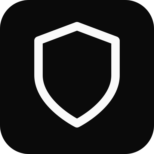
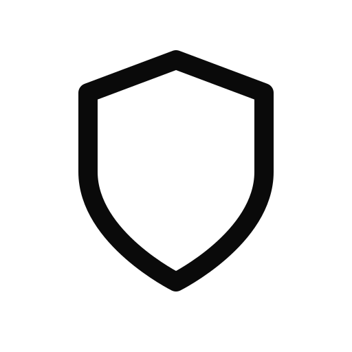
盾牌標誌
UniAuth 盾牌是主要的品牌標誌。請在登入按鈕、應用程式列表與文件中將其作為易於辨識的圖示使用。
<img src="https://uniauth.id/brand/oauth/mark.svg" alt="UniAuth" width="24" height="24" />登入按鈕
互動式試用區——選擇主題、尺寸、形狀與文字,即可在真實的滑鼠停留狀態下即時預覽按鈕。複製產生的 HTML 即可嵌入您的應用程式。
即時示範 — 滑入並點擊
SVG 資產


信任徽章
互動式試用區——選擇主題與文字樣式,即可在滑鼠停留效果下即時預覽徽章。複製 HTML 即可嵌入您的頁尾、側邊欄或結帳頁面。
扁平膠囊徽章
適用於 README 檔案、文件與儀表板的 shields.io 風格扁平徽章。選擇一種樣式並複製 Markdown 或 HTML。

信任印記
適用於結帳頁面、側邊欄與安全頁面的醒目信任印記。切換主題與樣式進行預覽,然後複製 HTML。

浮動徽章與信任列
即時示範——切換以顯示螢幕角落的浮動徽章或頁尾的信任列。將滑鼠停留在浮動徽章上即可看到浮起效果。
小工具——隨插即用的 JavaScript
新增 UniAuth 登入最快的方式。一個 script 標籤即可呈現品牌按鈕,並自動處理完整的 PKCE OAuth 流程。
彈出視窗模式(建議用於桌面)
使用者停留在您的頁面上,驗證在彈出視窗中進行,權杖透過回呼傳遞。
<script src="https://uniauth.id/brand/oauth/uniauth-widget.js"></script>

<div id="uniauth-signin"></div>

<script>
  UniAuth.renderButton('#uniauth-signin', {
    clientId: 'your-client-id',
    redirectUri: 'https://yourapp.com/callback',
    mode: 'popup',  // opens auth in a centered popup
    theme: 'dark',
    onSuccess: function(result) {
      console.log('Logged in!', result.accessToken);
    },
    onError: function(err) {
      console.error('Auth failed:', err.error);
    }
  });
</script>
重新導向模式
將整個頁面導向 UniAuth,再帶著授權碼重新導向返回。在任何環境都能運作。
<script src="https://uniauth.id/brand/oauth/uniauth-widget.js"></script>

<div id="uniauth-signin"></div>

<script>
  UniAuth.renderButton('#uniauth-signin', {
    clientId: 'your-client-id',
    redirectUri: 'https://yourapp.com/callback',
    mode: 'redirect',  // full-page navigation
    theme: 'dark'
  });
</script>

<!-- On your /callback page: -->
<script>
  UniAuth.handleCallback({
    clientId: 'your-client-id',
    redirectUri: 'https://yourapp.com/callback'
  }).then(function(result) {
    if (result.success) {
      console.log('Access token:', result.accessToken);
    }
  });
</script>
自動偵測(預設)
mode 省略時會自動偵測:桌面使用彈出視窗,行動裝置使用重新導向。
UniAuth.renderButton('#uniauth-signin', {
  clientId: 'your-client-id',
  redirectUri: 'https://yourapp.com/callback',
  // mode omitted — auto-detects popup (desktop) or redirect (mobile)
});
所有選項
| 選項 | 型別 | 預設 | 說明 |
|---|---|---|---|
| clientId | string | — | 您的 OAuth 用戶端 ID(必填) |
| redirectUri | string | origin/callback | 驗證後重新導向的目標位址 |
| mode | string | auto | "popup" | "redirect" — 省略時自動偵測 |
| scope | string | "openid profile email" | 要求的 OAuth 範圍 |
| theme | string | "dark" | "dark" | "light" | "outline" | "neutral" |
| size | string | "standard" | "small" | "standard" | "large" |
| text | string | "signin" | "signin" | "continue" |
| shape | string | "rectangular" | "rectangular" | "pill" |
| width | number | auto | 固定寬度(像素) |
| locale | string | "en" | 按鈕文字的語言 |
| onSuccess | function | — | 彈出視窗驗證完成後接收權杖的回呼 |
| onError | function | — | 驗證發生錯誤或彈出視窗關閉時的回呼 |
| onSignIn | function | — | 自訂的點擊處理常式(略過 OAuth 流程) |
| popupWidth | number | 480 | 彈出視窗的寬度(像素) |
| popupHeight | number | 640 | 彈出視窗的高度(像素) |
| loginHint | string | — | 在 UniAuth 登入畫面預先填入電子郵件 |
| prompt | string | — | "login" | "consent" | "none" |
| nonce | string | — | 用於防止重放攻擊的 ID 權杖 nonce |
呈現徽章
<div id="uniauth-badge"></div>
<script>
  UniAuth.renderBadge('#uniauth-badge', {
    theme: 'light',  // 'light' | 'dark'
    text: 'secured'  // 'powered' | 'secured' | 'identity'
  });
</script>
CSS 類別——HTML 整合
若需完整控制,請使用具備語意化類別名稱的獨立 CSS 檔案。無需 JavaScript——只要 HTML 與 CSS。
引入樣式表
<link rel="stylesheet"
      href="https://uniauth.id/brand/oauth/uniauth-buttons.css" />
深色按鈕
<a href="https://uniauth.id/api/oauth/authorize?client_id=YOUR_ID&..."
   class="uniauth-btn uniauth-btn-dark">
  <span class="uniauth-btn-icon"></span>
  Sign in with UniAuth
</a>
淺色按鈕
<a href="..." class="uniauth-btn uniauth-btn-light">
  <span class="uniauth-btn-icon"></span>
  Sign in with UniAuth
</a>
外框按鈕
<a href="..." class="uniauth-btn uniauth-btn-outline">
  <span class="uniauth-btn-icon"></span>
  Continue with UniAuth
</a>
修飾類別
<!-- Small -->
<a class="uniauth-btn uniauth-btn-dark uniauth-btn-sm">...</a>

<!-- Large -->
<a class="uniauth-btn uniauth-btn-light uniauth-btn-lg">...</a>

<!-- Pill shape -->
<a class="uniauth-btn uniauth-btn-dark uniauth-btn-pill">...</a>

<!-- Full width -->
<a class="uniauth-btn uniauth-btn-dark uniauth-btn-block">...</a>

<!-- Icon only -->
<a class="uniauth-btn uniauth-btn-dark uniauth-btn-icon-only">
  <span class="uniauth-btn-icon"></span>
</a>

<!-- Disabled -->
<a class="uniauth-btn uniauth-btn-dark" disabled>...</a>

<!-- Loading -->
<a class="uniauth-btn uniauth-btn-dark uniauth-btn-loading">
  <span class="uniauth-btn-icon"></span>
  Signing in...
</a>
徽章類別
<a href="https://uniauth.id" class="uniauth-badge uniauth-badge-light">
  <span class="uniauth-badge-icon"></span>
  <span>Powered by <strong>UniAuth</strong></span>
</a>

<a href="https://uniauth.id" class="uniauth-badge uniauth-badge-dark">
  <span class="uniauth-badge-icon"></span>
  <span>Secured by <strong>UniAuth</strong></span>
</a>
React 元件
適用於 Next.js、Vite 或任何 React 應用程式的隨插即用 React 元件。可使用官方 @uniauth/react SDK,也可獨立使用。
搭配 @uniauth/react SDK
import { UniAuthProvider, LoginButton } from '@uniauth/react';

function App() {
  return (
    <UniAuthProvider
      issuer="https://uniauth.id"
      clientId="your-client-id"
      redirectUri="https://yourapp.com/callback"
    >
      <LoginButton theme="dark" />
    </UniAuthProvider>
  );
}
獨立元件
interface UniAuthButtonProps {
  clientId: string;
  redirectUri: string;
  scope?: string;
  theme?: 'dark' | 'light' | 'outline' | 'neutral';
  size?: 'small' | 'standard' | 'large';
  text?: 'signin' | 'continue';
  className?: string;
}

const SHIELD_SVG = `<svg xmlns="http://www.w3.org/2000/svg" width="20" height="20"
  viewBox="0 0 24 24" fill="none">
  <path d="M12 22s8-4 8-10V5l-8-3-8 3v7c0 6 8 10 8 10z"
    stroke="currentColor" stroke-width="2"
    stroke-linecap="round" stroke-linejoin="round"/>
</svg>`;

export function UniAuthButton({
  clientId,
  redirectUri,
  scope = 'openid profile email',
  theme = 'dark',
  size = 'standard',
  text = 'signin',
  className = '',
}: UniAuthButtonProps) {
  const label = text === 'continue'
    ? 'Continue with UniAuth'
    : 'Sign in with UniAuth';

  const heights = { small: 'h-9', standard: 'h-11', large: 'h-[52px]' };
  const iconSizes = { small: 'w-[34px]', standard: 'w-[42px]', large: 'w-[50px]' };
  const fonts = { small: 'text-[13px]', standard: 'text-sm', large: 'text-base' };

  const themes = {
    dark: 'bg-[#0a0a0a] border-[#0a0a0a] text-[#fafafa] hover:bg-[#262626]',
    light: 'bg-white border-[#d4d4d4] text-[#0a0a0a] hover:bg-[#f5f5f5]',
    outline: 'bg-transparent border-[#a3a3a3] text-[#262626] hover:bg-black/[0.04]',
    neutral: 'bg-[#f5f5f5] border-[#e5e5e5] text-[#171717] hover:bg-[#e5e5e5]',
  };

  async function handleClick() {
    const array = new Uint8Array(32);
    crypto.getRandomValues(array);
    const verifier = btoa(String.fromCharCode(...array))
      .replace(/\+/g, '-').replace(/\//g, '_').replace(/=+$/, '');

    const digest = await crypto.subtle.digest(
      'SHA-256', new TextEncoder().encode(verifier)
    );
    const challenge = btoa(String.fromCharCode(...new Uint8Array(digest)))
      .replace(/\+/g, '-').replace(/\//g, '_').replace(/=+$/, '');

    const stateArr = new Uint8Array(16);
    crypto.getRandomValues(stateArr);
    const state = btoa(String.fromCharCode(...stateArr))
      .replace(/\+/g, '-').replace(/\//g, '_').replace(/=+$/, '');

    sessionStorage.setItem('uniauth_code_verifier', verifier);
    sessionStorage.setItem('uniauth_state', state);

    const params = new URLSearchParams({
      response_type: 'code',
      client_id: clientId,
      redirect_uri: redirectUri,
      scope,
      state,
      code_challenge: challenge,
      code_challenge_method: 'S256',
    });

    window.location.href =
      `https://uniauth.id/api/oauth/authorize?${params}`;
  }

  return (
    <button
      type="button"
      onClick={handleClick}
      aria-label={label}
      className={`inline-flex items-center gap-0 border rounded-md
        font-medium transition-colors cursor-pointer select-none
        ${heights[size]} ${fonts[size]} ${themes[theme]} ${className}`}
      style={{ paddingRight: size === 'large' ? 20 : 16 }}
    >
      <span
        className={`flex items-center justify-center
          ${iconSizes[size]} ${heights[size]}
          border-r border-current/15`}
        dangerouslySetInnerHTML={{ __html: SHIELD_SVG }}
      />
      <span className="flex-1 text-center">{label}</span>
    </button>
  );
}
SVG 按鈕嵌入
預先繪製的按鈕 SVG——最簡單的整合方式。只要嵌入為 <img> 或 <object> 即可,無需 CSS 或 JS。
<!-- Dark "Sign in" button -->
<a href="https://uniauth.id/api/oauth/authorize?client_id=YOUR_ID&...">
  <img src="https://uniauth.id/brand/oauth/btn-signin-dark.svg"
       alt="Sign in with UniAuth" height="44" />
</a>

<!-- Light "Sign in" button -->
<img src="https://uniauth.id/brand/oauth/btn-signin-light.svg"
     alt="Sign in with UniAuth" height="44" />

<!-- Outline "Sign in" button -->
<img src="https://uniauth.id/brand/oauth/btn-signin-outline.svg"
     alt="Sign in with UniAuth" height="44" />

<!-- Dark "Continue with" button -->
<img src="https://uniauth.id/brand/oauth/btn-continue-dark.svg"
     alt="Continue with UniAuth" height="44" />

<!-- Icon-only buttons -->
<img src="https://uniauth.id/brand/oauth/btn-icon-dark.svg"
     alt="UniAuth" width="44" height="44" />
<img src="https://uniauth.id/brand/oauth/btn-icon-light.svg"
     alt="UniAuth" width="44" height="44" />
可用的 SVG 檔案
| 檔案 | 尺寸 | 說明 |
|---|---|---|
| btn-signin-dark.svg | 240 x 44 | 深色「Sign in with UniAuth」 |
| btn-signin-light.svg | 240 x 44 | 淺色「Sign in with UniAuth」 |
| btn-signin-outline.svg | 240 x 44 | 外框「Sign in with UniAuth」 |
| btn-continue-dark.svg | 260 x 44 | 深色「Continue with UniAuth」 |
| btn-continue-light.svg | 260 x 44 | 淺色「Continue with UniAuth」 |
| btn-icon-dark.svg | 44 x 44 | 深色純圖示按鈕 |
| btn-icon-light.svg | 44 x 44 | 淺色純圖示按鈕 |
| btn-icon-outline.svg | 44 x 44 | 外框純圖示按鈕 |
品牌使用準則
請遵循這些準則,以確保在您的應用程式中一致地呈現 UniAuth 品牌。
建議
- 依原樣使用官方的按鈕 SVG 或 CSS 類別
- 在按鈕周圍保留至少 8px 的留白
- 在淺色背景使用深色版本,在深色背景使用淺色版本
- 將按鈕設定為與您介面中其他社群登入按鈕相近的尺寸
- 使用「Sign in with UniAuth」或「Continue with UniAuth」作為按鈕文字
- 納入盾牌圖示——這是主要的辨識標誌
避免
- 更改盾牌圖示的形狀、比例或線條粗細
- 為盾牌加上色彩填滿——它一律是純線條標誌
- 在沒有合作關係的情況下使用 UniAuth 標誌來暗示背書
- 將按鈕呈現得低於 36px 高,或更改其文字
- 將按鈕放在會降低對比度的雜亂背景上
- 旋轉、傾斜或對標誌套用效果(陰影、光暈)
色彩配置
UniAuth 採用單色調配置。所有品牌元素都使用中性灰階——沒有任何強調色。
-apple-system, BlinkMacSystemFont, "Segoe UI", Roboto, Helvetica, Arial, sans-serif。按鈕文字使用字重 500(中等),「UniAuth」文字標誌使用 700(粗體)。所有下載
識別套件中的所有素材,依類型整理。
按鈕 SVG
信任徽章
扁平膠囊徽章
信任印記
完整標誌套件
多種尺寸的 PNG/SVG 圖示與完整標誌也可在 /brand/ 目錄中取得。