ブランド・アイデンティティキット
UniAuth サインインをアプリケーションに組み込むための公式アセットです。シールドマーク、既製ボタン、バッジ、埋め込みウィジェットをすべて一か所にまとめています。
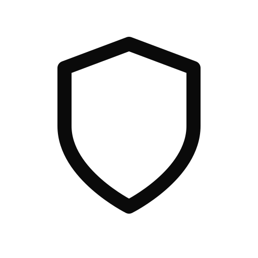
シールドマーク
UniAuth のシールドは主要なブランドマークです。サインインボタン、アプリ一覧、ドキュメントで認識しやすいアイコンとしてご利用ください。
<img src="https://uniauth.id/brand/oauth/mark.svg" alt="UniAuth" width="24" height="24" />サインインボタン
インタラクティブなプレイグラウンドです。テーマ・サイズ・形状・テキストを選ぶと、実際のホバー状態付きでボタンをライブプレビューできます。生成された HTML をコピーしてアプリに埋め込んでください。
ライブデモ — ホバーとクリック
SVGアセット


トラストバッジ
インタラクティブなプレイグラウンドです。テーマとテキストの種類を選ぶと、ホバー効果付きでバッジをライブプレビューできます。HTML をコピーして、フッター、サイドバー、決済ページに埋め込んでください。
フラットピルバッジ
README、ドキュメント、ダッシュボード向けの shields.io 風フラットバッジです。バリエーションを選んで Markdown または HTML をコピーしてください。

トラストシール
決済ページ、サイドバー、セキュリティページ向けの目立つトラストシールです。テーマとスタイルを切り替えてプレビューし、HTML をコピーしてください。

フローティングバッジとトラストバー
ライブデモです。切り替えると、画面隅のフローティングバッジやフッターのトラストバーを表示できます。フローティングバッジにカーソルを重ねると浮き上がる効果を確認できます。
ウィジェット — そのまま使える JavaScript
UniAuth サインインを追加する最速の方法です。script タグ 1 つでブランドボタンを表示し、PKCE による OAuth フロー全体を自動で処理します。
ポップアップモード(デスクトップ推奨)
ユーザーはページに留まったまま、認証はポップアップ内で行われます。トークンはコールバックで渡されます。
<script src="https://uniauth.id/brand/oauth/uniauth-widget.js"></script>

<div id="uniauth-signin"></div>

<script>
  UniAuth.renderButton('#uniauth-signin', {
    clientId: 'your-client-id',
    redirectUri: 'https://yourapp.com/callback',
    mode: 'popup',  // opens auth in a centered popup
    theme: 'dark',
    onSuccess: function(result) {
      console.log('Logged in!', result.accessToken);
    },
    onError: function(err) {
      console.error('Auth failed:', err.error);
    }
  });
</script>
リダイレクトモード
ページ全体を UniAuth へ遷移させ、コード付きでリダイレクトして戻ります。どの環境でも動作します。
<script src="https://uniauth.id/brand/oauth/uniauth-widget.js"></script>

<div id="uniauth-signin"></div>

<script>
  UniAuth.renderButton('#uniauth-signin', {
    clientId: 'your-client-id',
    redirectUri: 'https://yourapp.com/callback',
    mode: 'redirect',  // full-page navigation
    theme: 'dark'
  });
</script>

<!-- On your /callback page: -->
<script>
  UniAuth.handleCallback({
    clientId: 'your-client-id',
    redirectUri: 'https://yourapp.com/callback'
  }).then(function(result) {
    if (result.success) {
      console.log('Access token:', result.accessToken);
    }
  });
</script>
自動判別(デフォルト)
mode を省略すると自動判別します(デスクトップはポップアップ、モバイルはリダイレクト)。
UniAuth.renderButton('#uniauth-signin', {
  clientId: 'your-client-id',
  redirectUri: 'https://yourapp.com/callback',
  // mode omitted — auto-detects popup (desktop) or redirect (mobile)
});
全オプション
| オプション | 型 | デフォルト | 説明 |
|---|---|---|---|
| clientId | string | — | OAuth クライアント ID(必須) |
| redirectUri | string | origin/callback | 認証後のリダイレクト先 |
| mode | string | auto | "popup" | "redirect" — 省略時は自動判別 |
| scope | string | "openid profile email" | 要求する OAuth スコープ |
| theme | string | "dark" | "dark" | "light" | "outline" | "neutral" |
| size | string | "standard" | "small" | "standard" | "large" |
| text | string | "signin" | "signin" | "continue" |
| shape | string | "rectangular" | "rectangular" | "pill" |
| width | number | auto | 固定幅(ピクセル) |
| locale | string | "en" | ボタンテキストの言語 |
| onSuccess | function | — | ポップアップ認証完了後にトークンを受け取るコールバック |
| onError | function | — | 認証エラーまたはポップアップが閉じられた際のコールバック |
| onSignIn | function | — | 独自のクリックハンドラー(OAuth フローをスキップ) |
| popupWidth | number | 480 | ポップアップウィンドウの幅(ピクセル) |
| popupHeight | number | 640 | ポップアップウィンドウの高さ(ピクセル) |
| loginHint | string | — | UniAuth ログイン画面にメールアドレスを事前入力 |
| prompt | string | — | "login" | "consent" | "none" |
| nonce | string | — | リプレイ攻撃対策用の ID トークン nonce |
バッジのレンダリング
<div id="uniauth-badge"></div>
<script>
  UniAuth.renderBadge('#uniauth-badge', {
    theme: 'light',  // 'light' | 'dark'
    text: 'secured'  // 'powered' | 'secured' | 'identity'
  });
</script>
CSS クラス — HTML 連携
細かく制御したい場合は、セマンティックなクラス名を備えた単体の CSS ファイルをご利用ください。JavaScript は不要で、HTML と CSS だけで動作します。
スタイルシートの読み込み
<link rel="stylesheet"
      href="https://uniauth.id/brand/oauth/uniauth-buttons.css" />
ダークボタン
<a href="https://uniauth.id/api/oauth/authorize?client_id=YOUR_ID&..."
   class="uniauth-btn uniauth-btn-dark">
  <span class="uniauth-btn-icon"></span>
  Sign in with UniAuth
</a>
ライトボタン
<a href="..." class="uniauth-btn uniauth-btn-light">
  <span class="uniauth-btn-icon"></span>
  Sign in with UniAuth
</a>
アウトラインボタン
<a href="..." class="uniauth-btn uniauth-btn-outline">
  <span class="uniauth-btn-icon"></span>
  Continue with UniAuth
</a>
修飾クラス
<!-- Small -->
<a class="uniauth-btn uniauth-btn-dark uniauth-btn-sm">...</a>

<!-- Large -->
<a class="uniauth-btn uniauth-btn-light uniauth-btn-lg">...</a>

<!-- Pill shape -->
<a class="uniauth-btn uniauth-btn-dark uniauth-btn-pill">...</a>

<!-- Full width -->
<a class="uniauth-btn uniauth-btn-dark uniauth-btn-block">...</a>

<!-- Icon only -->
<a class="uniauth-btn uniauth-btn-dark uniauth-btn-icon-only">
  <span class="uniauth-btn-icon"></span>
</a>

<!-- Disabled -->
<a class="uniauth-btn uniauth-btn-dark" disabled>...</a>

<!-- Loading -->
<a class="uniauth-btn uniauth-btn-dark uniauth-btn-loading">
  <span class="uniauth-btn-icon"></span>
  Signing in...
</a>
バッジ用クラス
<a href="https://uniauth.id" class="uniauth-badge uniauth-badge-light">
  <span class="uniauth-badge-icon"></span>
  <span>Powered by <strong>UniAuth</strong></span>
</a>

<a href="https://uniauth.id" class="uniauth-badge uniauth-badge-dark">
  <span class="uniauth-badge-icon"></span>
  <span>Secured by <strong>UniAuth</strong></span>
</a>
React コンポーネント
Next.js、Vite をはじめ、あらゆる React アプリで使えるコンポーネントです。公式 SDK @uniauth/react を使用することも、単体で使用することもできます。
@uniauth/react SDK を使う場合
import { UniAuthProvider, LoginButton } from '@uniauth/react';

function App() {
  return (
    <UniAuthProvider
      issuer="https://uniauth.id"
      clientId="your-client-id"
      redirectUri="https://yourapp.com/callback"
    >
      <LoginButton theme="dark" />
    </UniAuthProvider>
  );
}
単体コンポーネント
interface UniAuthButtonProps {
  clientId: string;
  redirectUri: string;
  scope?: string;
  theme?: 'dark' | 'light' | 'outline' | 'neutral';
  size?: 'small' | 'standard' | 'large';
  text?: 'signin' | 'continue';
  className?: string;
}

const SHIELD_SVG = `<svg xmlns="http://www.w3.org/2000/svg" width="20" height="20"
  viewBox="0 0 24 24" fill="none">
  <path d="M12 22s8-4 8-10V5l-8-3-8 3v7c0 6 8 10 8 10z"
    stroke="currentColor" stroke-width="2"
    stroke-linecap="round" stroke-linejoin="round"/>
</svg>`;

export function UniAuthButton({
  clientId,
  redirectUri,
  scope = 'openid profile email',
  theme = 'dark',
  size = 'standard',
  text = 'signin',
  className = '',
}: UniAuthButtonProps) {
  const label = text === 'continue'
    ? 'Continue with UniAuth'
    : 'Sign in with UniAuth';

  const heights = { small: 'h-9', standard: 'h-11', large: 'h-[52px]' };
  const iconSizes = { small: 'w-[34px]', standard: 'w-[42px]', large: 'w-[50px]' };
  const fonts = { small: 'text-[13px]', standard: 'text-sm', large: 'text-base' };

  const themes = {
    dark: 'bg-[#0a0a0a] border-[#0a0a0a] text-[#fafafa] hover:bg-[#262626]',
    light: 'bg-white border-[#d4d4d4] text-[#0a0a0a] hover:bg-[#f5f5f5]',
    outline: 'bg-transparent border-[#a3a3a3] text-[#262626] hover:bg-black/[0.04]',
    neutral: 'bg-[#f5f5f5] border-[#e5e5e5] text-[#171717] hover:bg-[#e5e5e5]',
  };

  async function handleClick() {
    const array = new Uint8Array(32);
    crypto.getRandomValues(array);
    const verifier = btoa(String.fromCharCode(...array))
      .replace(/\+/g, '-').replace(/\//g, '_').replace(/=+$/, '');

    const digest = await crypto.subtle.digest(
      'SHA-256', new TextEncoder().encode(verifier)
    );
    const challenge = btoa(String.fromCharCode(...new Uint8Array(digest)))
      .replace(/\+/g, '-').replace(/\//g, '_').replace(/=+$/, '');

    const stateArr = new Uint8Array(16);
    crypto.getRandomValues(stateArr);
    const state = btoa(String.fromCharCode(...stateArr))
      .replace(/\+/g, '-').replace(/\//g, '_').replace(/=+$/, '');

    sessionStorage.setItem('uniauth_code_verifier', verifier);
    sessionStorage.setItem('uniauth_state', state);

    const params = new URLSearchParams({
      response_type: 'code',
      client_id: clientId,
      redirect_uri: redirectUri,
      scope,
      state,
      code_challenge: challenge,
      code_challenge_method: 'S256',
    });

    window.location.href =
      `https://uniauth.id/api/oauth/authorize?${params}`;
  }

  return (
    <button
      type="button"
      onClick={handleClick}
      aria-label={label}
      className={`inline-flex items-center gap-0 border rounded-md
        font-medium transition-colors cursor-pointer select-none
        ${heights[size]} ${fonts[size]} ${themes[theme]} ${className}`}
      style={{ paddingRight: size === 'large' ? 20 : 16 }}
    >
      <span
        className={`flex items-center justify-center
          ${iconSizes[size]} ${heights[size]}
          border-r border-current/15`}
        dangerouslySetInnerHTML={{ __html: SHIELD_SVG }}
      />
      <span className="flex-1 text-center">{label}</span>
    </button>
  );
}
SVG ボタン埋め込み
事前レンダリング済みのボタン SVG — 最もシンプルな連携方法です。 <img> または <object> タグとして埋め込むだけで、CSS も JS も不要です。
<!-- Dark "Sign in" button -->
<a href="https://uniauth.id/api/oauth/authorize?client_id=YOUR_ID&...">
  <img src="https://uniauth.id/brand/oauth/btn-signin-dark.svg"
       alt="Sign in with UniAuth" height="44" />
</a>

<!-- Light "Sign in" button -->
<img src="https://uniauth.id/brand/oauth/btn-signin-light.svg"
     alt="Sign in with UniAuth" height="44" />

<!-- Outline "Sign in" button -->
<img src="https://uniauth.id/brand/oauth/btn-signin-outline.svg"
     alt="Sign in with UniAuth" height="44" />

<!-- Dark "Continue with" button -->
<img src="https://uniauth.id/brand/oauth/btn-continue-dark.svg"
     alt="Continue with UniAuth" height="44" />

<!-- Icon-only buttons -->
<img src="https://uniauth.id/brand/oauth/btn-icon-dark.svg"
     alt="UniAuth" width="44" height="44" />
<img src="https://uniauth.id/brand/oauth/btn-icon-light.svg"
     alt="UniAuth" width="44" height="44" />
利用可能な SVG ファイル
| ファイル | サイズ | 説明 |
|---|---|---|
| btn-signin-dark.svg | 240 x 44 | ダーク「Sign in with UniAuth」 |
| btn-signin-light.svg | 240 x 44 | ライト「Sign in with UniAuth」 |
| btn-signin-outline.svg | 240 x 44 | アウトライン「Sign in with UniAuth」 |
| btn-continue-dark.svg | 260 x 44 | ダーク「Continue with UniAuth」 |
| btn-continue-light.svg | 260 x 44 | ライト「Continue with UniAuth」 |
| btn-icon-dark.svg | 44 x 44 | アイコンのみボタン(ダーク) |
| btn-icon-light.svg | 44 x 44 | アイコンのみボタン(ライト) |
| btn-icon-outline.svg | 44 x 44 | アイコンのみボタン(アウトライン) |
ブランドガイドライン
アプリケーション内で UniAuth ブランドを一貫して表現するため、以下のガイドラインに従ってください。
推奨
- 公式のボタン SVG または CSS クラスを提供されたまま使用する
- ボタンの周囲に 8px 以上の余白を確保する
- 明るい背景にはダーク、暗い背景にはライトのバリエーションを使用する
- UI 内の他のソーシャルログインボタンと同程度のサイズにする
- ボタンテキストには「Sign in with UniAuth」または「Continue with UniAuth」を使用する
- シールドアイコンを含める — 主要な認識マークです
禁止
- シールドアイコンの形状・比率・線の太さを変更する
- シールドに塗りつぶしを加える — 常に線のみのマークです
- パートナーシップがないのに UniAuth ロゴで推奨・提携を示唆する
- ボタンを高さ 36px 未満で表示する、またはテキストを変更する
- コントラストを損なう複雑な背景にボタンを配置する
- マークを回転・変形させたり、効果(ドロップシャドウ、グロー)を適用する
カラーパレット
UniAuth はモノクロパレットを使用しています。すべてのブランド要素はニュートラルなグレーで構成され、アクセントカラーはありません。
-apple-system, BlinkMacSystemFont, "Segoe UI", Roboto, Helvetica, Arial, sans-serif。ボタンテキストはウェイト 500(ミディアム)、「UniAuth」ワードマークは 700(ボールド)を使用します。すべてのダウンロード
アイデンティティキットの全アセットを種類別に整理しています。
ボタン SVG
トラストバッジ
フラットピルバッジ
トラストシール
フルロゴキット
マルチサイズの PNG/SVG アイコンとフルロゴは /brand/ ディレクトリにも用意されています。
導入の準備はできましたか?
開発者コンソールで OAuth アプリケーションを登録してクライアント ID を取得し、上記のいずれかの方法で UniAuth サインインを追加してください。